Analyzing Chicago COVID-19 Mortality in the Second Wave

About the report
During the COVID-19 pandemic, the School of Public Health’s Public Health Geographic Information Systems program has been conducting spatial and graphical analyses of the substantial public health data generated during this crisis. This report seeks to demonstrate the unique characteristics of the first and second waves of the COVID-19 pandemic in the Chicagoland area, to better inform policymakers and public health agencies as the pandemic continues.
Other reports in this series
Introduction
The COVID-19 phenomenon, as represented by mortality data, evolves in time and space. During the first wave, an alarming reality was recorded for the older population of the Chicagol area residing in long-term care facilities (LTCF). The dimensions of this inequitable public health crisis, for data through July 31, 2020, are seen in the table below.
As dire as this is, the mortality rate picture becomes much more alarming if the population living in “group quarters” is used as a denominator for the LTCF mortality rate. In the table below, the group quarters column reflects the mortality rate as a percent of the people living in those group quarters. Given that the overall mortality rate for the City of Chicago is approximately 0.1 percent, the LTCF rates in the table reveal the alarming level of this disparity.
Top 10 zip codes by mortality rates in Chicago
| White household population | White LTCF | Black household population | Black LTCF | ||||||
|---|---|---|---|---|---|---|---|---|---|
| ZIP code | Mortality | Zip code | Mortality | Group quarters | Zip code | Mortality | Zip code | Mortality | Group quarters |
| 60632 | 21 | 60714 | 66 | 5.2 | 60623 | 86 | 60649 | 85 | 8.8 |
| 60623 | 18 | 60626 | 50 | 1.4 | 60804 | 51 | 60453 | 39 | 7.1 |
| 60639 | 18 | 60090 | 38 | 6.6 | 60629 | 50 | 60644 | 33 | 3.4 |
| 60629 | 17 | 60463 | 37 | 4.4 | 60639 | 50 | 60626 | 32 | 0.9 |
| 60638 | 17 | 60614 | 36 | 0.9 | 60632 | 43 | 60652 | 28 | 13.5 |
| 60630 | 15 | 60016 | 35 | 3.9 | 60647 | 33 | 60430 | 23 | 7.1 |
| 60625 | 14 | 60068 | 33 | 6.4 | 60608 | 32 | 60628 | 22 | 3.5 |
| 60634 | 13 | 60640 | 32 | 1.2 | 60609 | 25 | 60473 | 21 | 3.0 |
| 60804 | 12 | 60706 | 31 | 7.1 | 60618 | 25 | 60621 | 21 | 3.3 |
| 60608 | 12 | 60026 | 29 | 9.2 | 60641 | 21 | 60632 | 15 | 5.0 |
| Avg. | 15.7 | 38.6 | 4.6% | 41.6 | 31.9 | 5.69% |
The time dimension
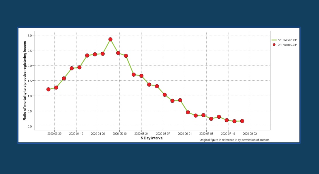
To assess the spatial evolution of the phenomenon and to identify a stabilization threshold, the ratio of new mortalities in the ZIP codes registering losses was used at a five-day-interval scale for the overall population. As seen in the table above, this metric based on the overall population mortality enters a plateau phase, with ZIP codes stabilizing by the end of June at a 150 level and mortality at five losses per day. Overall population mortality was selected to demonstrate the progression of the phenomenon, since this outcome was commonly used in studies even before its peak.
The time dimension, continued
In a highly developed urban region such as Cook County, the analytical framework developed by the UIC School of Public Health’s Public Health Geographic Information Systems team can provide a useful insight into the characteristics of the first wave (or surge). This is accomplished by separating the mortality of the overall population into its two major constituents: long-term care facilities and household population. By doing so in the chart above, the overall mortality pattern of the pandemic is discerned, confirming the above stabilization threshold after the end of June. This threshold is likely to signify the end of the first wave as well.
The time dimension, continued
The chart above reveals the importance of time as a defining parameter of this pandemic. As seen from this comparison, the early epidemic phenomenon (through April 30, 2020) has different characteristics from its first wave conclusion (through July 31, 2020). In addition, in the early period a high number of ZIP codes have zero losses (31 percent) which renders results from the application of spatial statistics such as Moran’s I biased (in other words, in the equation the deviation term from the mean will always be negative).
The time dimension, continued
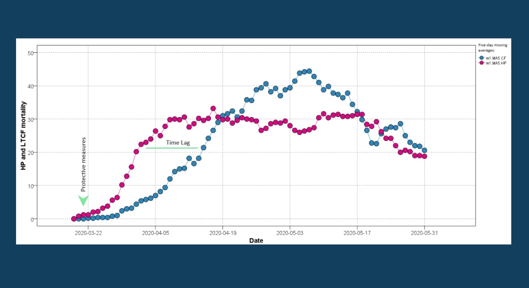
A closer look at the initial phase of the first wave reveals a time lag between household population and LTCF-related mortality rates (see the chart above; time lag in this context is the delay to reach the same outcome). This lag supports, to a certain degree, the assertion made in publications that COVID-19 was mainly transmitted to LTCF residents from the community (by visitations and staff).
The data pattern of the household population mortality illustrates the effectiveness of stay-at-home measures implemented by the State of Illinois on March 21, 2020. These measures managed to stabilize and eventually reduce the mortality rate. Unfortunately, the mid-March measures taken by the Centers for Medicare & Medicaid Services (CMS) to protect LTCF residents did not yield similar results. As seen in the chart above after lagging the household population losses (maximum time lag of three weeks), LTCF mortality continued its upward trend, surpassing the household population losses. This trend was finally reversed almost two months after the LTCF protective measures were implemented.
The time dimension, continued
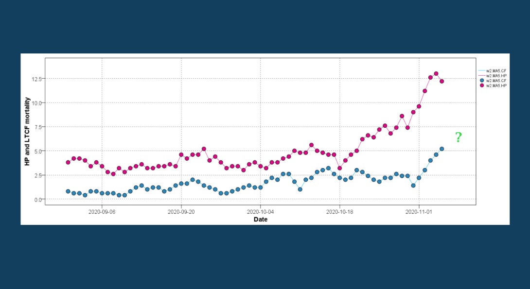
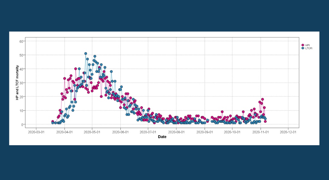
Taking into account the characteristics of the first wave allows us to make an early assessment of the second wave. This is seen in the chart above, where the five-day moving average is used to depict the household population and LTCF patterns of losses. The almost parallel trajectories signify that the COVID-19 transmission pathway to LTCF residents remains active. The latter part of the second-wave graph raises serious concerns, since after mid-October it appears likely that the LTCF related mortality is entering an acceleration phase.
The time dimension, continued.
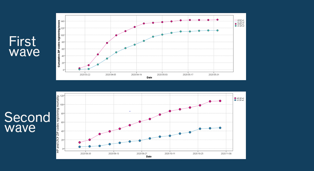
A comparison of the spread (cumulative number of ZIP codes registering losses) between the two waves indicates that the intensity (number of ZIP codes registering losses per time) is less at this initial phase than later one (see the charts above). What remains to be seen during this second wave is whether the metric will reach its asymptotic trajectory soon for both populations, hopefully with a lower asymptote.
The time dimension, continued.
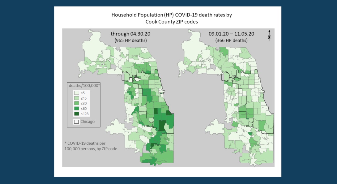
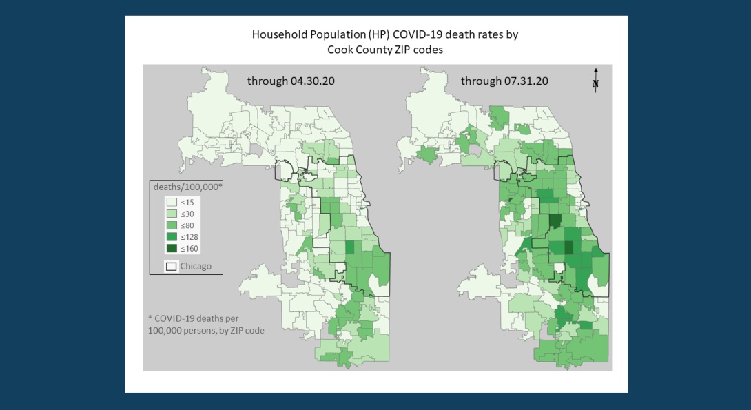
The comparison maps in the chart above indicate that the second wave is underway at a slower pace than the first one with 366 cumulative household population losses. Through April 30, 2020, close to the peak of the first wave, the cumulative household population losses were 965. At this early phase, the second wave seems to be concentrated at the periphery of Chicago, and the hard-hit corridor of ZIP codes in the western and southeastern districts of the city, is not exhibiting the elevated levels of losses seen before.
Recommendations
It is not certain that the second mortality wave will have a pattern similar to that established by the first wave. Very likely it will not, and the mortality rates will likely be lower, since treatment methods have improved and additional protective measures are in place. Nevertheless, the lack of a vaccine and the risk of a lag pattern evolving (hopefully at a much lower rate), warrants a reevaluation of the LTCF protective measures available, to avoid a repeat of the devastating losses for this vulnerable population. This recommendation is especially timely given the recent (September 17, 2020) CMS revised nursing home visitation guidance.
About the authors
Matthew Blaser is a geographic information systems research associate at the U.S. Environmental Protection Agency (EPA).
Michael D. Cailas, PhD, is an associate professor of environmental and occupational health sciences at the UIC School of Public Health. He directs SPH’s Public Health Geographic Information Systems online certificate program, and his research focuses on water quality monitoring network design, environmental data analysis, risk assessment and cost benefit analysis
John Canar, PhD in Environmental and Occupational Health Sciences ’97, is an environmental scientist at the U.S. EPA’s Superfund Division and an adjunct assistant professor of health policy and administration at the UIC School of Public Health.
Greg Arling, PhD, is a professor of nursing at Purdue University.
Brian Cooper is a program manager with the U.S. EPA’s Field Environmental Decision Support team within the Superfund Division and an affiliate faculty member with SPH’s division of health policy and administration.
Peter J. Geraci is an affiliate faculty member with SPH’s division of health policy and administration.
Kristin Osiecki, PhD in Environmental and Occupational Health Sciences ’13, MS in Environmental and Occupational Health Sciences ’11, is an assistant professor at the University of Minnesota Rochester and an adjunct instructor of health policy and administration at the UIC School of Public Health.
Apostolis Sambanis, PhD in Environmental and Occupational Health Sciences ’16, MS in Environmental and Occupational Health Sciences ’12, is the director of curriculum with SPH’s Emergency Management and Resilience Planning certificate program.