Using a Community Vulnerability Index for COVID-19 Vaccination
Introduction Heading link
The UIC School of Public Health Public Health Geographic Information Systems (PHGIS) program will be presenting a series of Midwest Comprehensive Visualization Dashboards focusing currently on public health issues of COVID-19 in this region. The dashboards have as their primary objectives to create visualizations that lead to operational insights that enhance data-driven decisions about mitigation efforts to eradicate COVID-19. They were explicitly designed to overcome some of the limitations identified in the plethora of dashboards appearing in response to the pandemic. This the third dashboard produced by our team, addressing COVID-19 vaccinations, provides information to assist public health professionals with the difficult task of prioritizing vaccinations and monitoring progress of vaccinations in Cook County, Illinois. The operational parameter that is included in this dashboard is a measure of vulnerability in the form of a social vulnerability index.
Dashboards: prioritizing vaccinations in Cook County, Illinois Heading link
View other COVID-19 dashboards Heading link
Vaccine prioritization frameworks Heading link
The National Academies of Sciences, Engineering, and Medicine (NASEM) recommended a four-phase framework for equitable COVID-19 vaccine allocation. For the latter phases, NASEM made the specific recommendation that “vaccine access should be prioritized for geographic areas identified through CDC’s Social Vulnerability index or another more specific index.”1
The CDC’s Social Vulnerability index (CDCSVI) is one of the many indices in use aiming to “help local officials identify communities that may need support before, during, or after disasters.”2 This index, which is constructed from census data at various scales of aggregation, seeks to classify the relative social vulnerability of a location to a hazard based on a combination of factors. The CDCSVI has a separate set of rankings for census tracts and counties according to 15 social attributes obtained from the American Community Survey, including unemployment, minority status and disability. The CDCSVI groups these attributes into four related themes: socioeconomic status, household composition and disability, minority status and language, and housing type and transportation.
A notable strength of the CDCSVI is the ease with which public health agencies can obtain the CDCSVI ranking of their location from the well-organized CDC portal. From the perspective of planning and resource allocation, social vulnerability is presumed to be an indicator of a community’s potential risk for COVID-19, along with the need for additional resources to mount mitigation efforts against the pandemic.
Classification of geographic units according to vulnerability and loss of life Heading link
To overcome the limitations of current reporting systems, we have developed COVID-19 dashboards for counties across Midwestern states. These dashboards report COVID-19 mortality in long-term care facilities (LTCFs) and the wider community, classify communities according to their vulnerability and provide periodically updated figures on vaccinations. The separation of LTCF and household COVID-19 mortality, which was recommended by the PHGIS team in July 2020,3 became even more crucial in this phase of the pandemic because vaccination rollouts have been far more rapid and comprehensive in LTCFs, which should lead to a steeper drop in mortality rates compared to household settings. For Cook County, Illinois, our dashboard operates at a census tract level to maximize the operational benefits.
The widespread adoption of social vulnerability indexes (SVIs) to prioritize COVID-19 vaccinations is becoming a reality. For example, the cities of Seattle and Chicago are taking into account SVIs to prioritize their plans for the latter phases. Specifically, the Chicago Department of Public Health created the COVID-19 Community Vulnerability Index (Chicago CCVI).4 This index goes beyond the CDCSVI input variable data set and incorporates components accounting for epidemiological and occupational risk factors as well as a cumulative COVID burden component.4 Methodologically, it differs from the CDCSVI since it does not create themes by using an additive model for its ranked input variables (like the CDCSVI). The Chicago CCVI is using the term components instead of themes, and in some cases, the components are averaged; for example, the two epidemiological risk components were averaged to derive the overall risk factor score.4
One limitation of these indexes is the lack of validation.4 In a recent publication we recommended that “the adoption of indices for vaccine prioritization should be carefully assessed, particularly for correspondence with outcomes (such as loss of life) in the context of the COVID-19 pandemic.”5 To this end, the PHGIS team proposed a validation approach based on the predictive performance matrix that quantifies certain performance characteristics.5 This multidimensional approach classifies geographic units (such as census tracts) ranked independently along two (or three) dimensions: COVID-19 mortality rate (number of deaths per population in either the LTCF or household setting), and a multi-factorial vulnerability index (such as the CDCSVI). Based on these rankings, we classify geographic units into tertiles or quartiles and visualize them in a matrix setting. This approach overcomes the one-dimensionality limitation of well-known indices such as the CDCSVI2 and the Surgo Ventures CCVI.6 A detailed and comprehensive assessment of these indices is under preparation for a forthcoming publication. The following case study will demonstrate the potentials of the UIC PHGIS approach.
About the dashboard Heading link
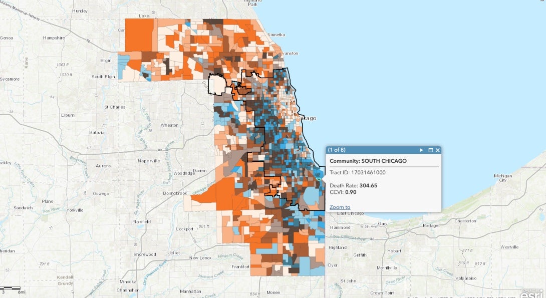
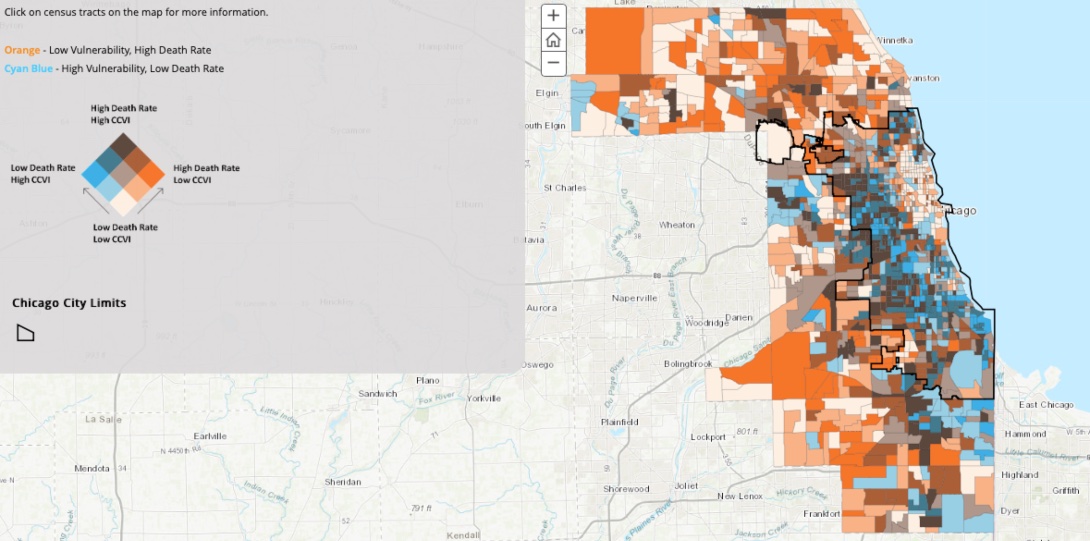
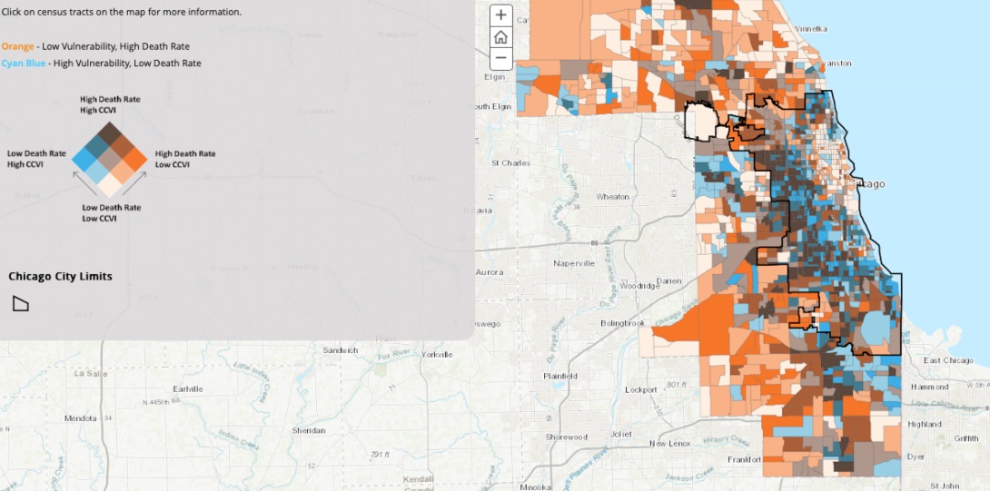
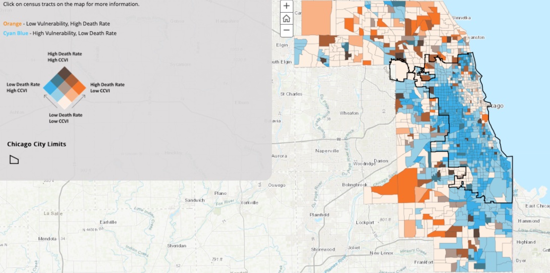
This interactive ArcGIS Online dashboard shows bivariate maps displaying COVID-19 mortality in relation to social vulnerability percentiles for Cook County, Illinois, at a census tract level. Based on our previous research,3 household and long-term care facility mortality rates are mapped separately. The mortality rates of the overall, household and LTCF populations are used to categorize the level of disaster losses in the census tracts. The level of vulnerability for each census tract is classified by using the summary (the summation of all themes) Surgo Ventures CCVI.6 For each mortality rate, a map is created (such as Household Population Deaths vs. CCVI) to display at a Cook County area scale the concordance between the two classifications for each census tract.
The bivariate maps, or more accurately choropleth maps (from Chóros/ χώρος meaning space and plēthos/ πλῆθος meaning multitude or many – in this case, variables), enable users to visualize the spatial relationship between the death rate and the CCVI rankings for each census tract. For the bivariate maps created by the tertiles of the variables, we assigned the visually distinguishable 3×3 color scheme in the adjacent figure. Thus, census tracts with an extreme discordance between the two variables are easily identified (for example, the orange and cyan blue horizontal edges of the color scheme).
By clicking on the census tracts, additional information is revealed. In this version of the dashboard, for census tracts within the Chicago City limits, the Chicago community area name is included.
Potential uses of the dashboard and the PPM Heading link
The current dashboard visualization provides an overall view of the concordance between the selected prioritization index (for example, CCVI) and the loss reality this prioritization is aiming to ameliorate. The UIC PHGIS predictive performance matrix approach provides a refined assessment of the prioritization strategy and quantitative metrics to make comparisons (such as UER) and optimizations. For example, the PPM approach can be used as an iterative strategy exploration/optimization tool with two (or more) operational parameters and an objective function which can satisfy vaccination equity concerns. For prioritizing a limited supply of vaccines, the optimization potentials of this approach provide an attractive rational alternative.
Data Sources and Limitations Heading link
The primary data source for this study is the Medical Examiner Case Archive of COVID-19-related Deaths.8 This archive is organized in a searchable online database format and contains information about “deaths that occurred in Cook County that were under the medical examiner’s jurisdiction.” The recorded cases not from Cook County have been removed.
Data preparation and preliminary analysis was performed with the IBM® SPSS® Modeller 18.2.1. During the data preparation phase, text-mining techniques were applied to identify the nursing home locations, identify miscoded address records, etc. For the Cook County mortality database a data quality iterative procedure was specifically developed by the PHGIS team. The main parameter was the address attribute of each record. Records lacking a structure number and street name were removed. The final phase of this procedure was the use of the geocoding process (for example, conversion of an address to an actual latitude/longitude coordinate point) with a performance threshold for termination of the data quality phase or to restart again. Without preparation, the original data records from the source had a conversion rate of less than 80 percent. For our studies, the performance threshold for conversion was set to a maximum of two percent.
Geocoding and aggregation at a census tract level was performed with the ArcGIS Pro locator, “ArcGIS World Geocoding Service”, and three address location categories: Address Address, Street Address, and Postal’s three subcategories. At the final iteration, less than 0.5 percent of the records were deleted as we could not confidently match to a proper address; this level of conversion was deemed acceptable for the goals of the study.
The socioeconomic data used to obtain the rates per 100,000 are available from the U.S. Census Bureau American Community Survey; 2018 release of 5-year estimates.
Additional details regarding source data limitations could be found at the exemplary “Medical Examiner Case Archive – COVID-19 Related Deaths” data portal maintained by the Cook County Medical Examiner’s Office.8
Concluding remarks Heading link
The main purpose of this article is to describe a visualization and vaccine prioritization tool for public health professionals. Due to the importance of this issue, we included a case study which provides additional tools for optimization. This information is vital for the multidimensional needs of an effective vaccination strategy which will account for population vulnerability as well as the realized losses within each community.
No attempt was made to draw insights from the application of this dashboard. The authors hope that public health professionals will undertake this task and share with us their findings.
About the authors Heading link
Matthew Blaser is a geographic information systems research associate at the U.S. Environmental Protection Agency (EPA).
Michael D. Cailas, PhD, is an associate professor of environmental and occupational health sciences at the UIC School of Public Health. He directs SPH’s Public Health Geographic Information Systems online certificate program, and his research focuses on water quality monitoring network design, environmental data analysis, risk assessment and cost benefit analysis
John Canar, PhD in Environmental and Occupational Health Sciences ’97, is an environmental scientist at the U.S. EPA’s Superfund Division and an adjunct assistant professor of health policy and administration at the UIC School of Public Health.
Greg Arling, PhD, is a professor of nursing at Purdue University.
References Heading link
- CDC Social Vulnerability Index. Centers for Disease Control and Prevention, Geospatial Research Analysis, and Services Program (GRASP), Division of Toxicology and Human Health Sciences.
- National Academies of Sciences, Engineering, and Medicine. 2020. Framework for Equitable Allocation of COVID-19 Vaccine. Washington, DC: The National Academies Press.
- M. Blaser, M. Cailas, J. Canar, et al. (2020): Analyzing COVID-19 Mortality Within the Chicagoland Area. University of Illinois Chicago. Research Brief No. 117. Policy, Practice and Prevention Research Center, University of Illinois Chicago. Chicago, IL. July 2020.
- Chicago COVID-19 Community Vulnerability Index. Chicago Department of Public Health. January 25, 2021.
- G. Arling, M. Blaser, M. Cailas, J. Canar, et al. (2021) A Data-Driven Approach for Prioritizing COVID-19 Vaccinations in the Midwestern United States. Journal of Public Health Informatics, 13(1), forthcoming Mar. 2021.
- Surgo Ventures. Vulnerable Communities and COVID-19: The Damage Done, and the Way Forward. Version 1. Published January 27, 2021. Accessed February 10, 2021.
- G. Arling, M. Blaser, M. Cailas, J. Canar, et al. (2020). A second wave of COVID-19 in Cook County: What lessons can be applied? Online Journal of Public Health Informatics, 12(2).
- Cook County Medical Examiner Case Archive – COVID-19 Related Deaths.