GIS Maps Use Social Vulnerability to Highlight Vaccine Needs
About the project Heading link
The UIC School of Public Health Public Health Geographic Information Systems (PHGIS) program is building a series of Midwest Comprehensive Visualization Dashboards (MCVD) focusing on public and environmental health issues in this region. The MCVD create visualizations that lead to operational insights that enhance data-driven decisions. They are explicitly designed to overcome some of the limitations identified during the COVID-19 pandemic and the plethora of dashboards created during this time.
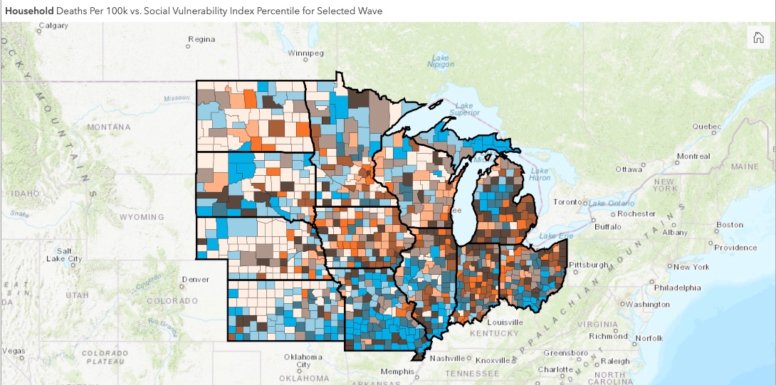
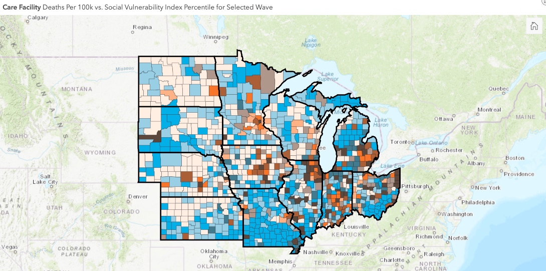
This dashboard focuses on assisting public health professionals with the difficult task of prioritizing vaccinations in their counties. The new operational parameter that is included in this dashboard is a measure of vulnerability encapsulated by the CDC’s Social Vulnerability index.
Maps: COVID-19 deaths and social vulnerability Heading link
View other COVID-19 reports and dashboards Heading link
View the maps
About the maps Heading link
The National Academies of Sciences, Engineering, and Medicine (NASEM) released a consensus study recommending a four-phase framework for equitable COVID-19 vaccine allocation. For the latter phases, NASEM made the specific recommendation that “vaccine access should be prioritized for geographic areas identified through CDC’s Social Vulnerability index or another more specific index.”
The CDC’s Social Vulnerability index (CDCSVI) is one of the many indices in use aiming to “help local officials identify communities that may need support before, during, or after disasters.”1 This SVI, which is constructed from census data at various scales of aggregation, seeks to classify the relative social vulnerability of a location to a hazard based on a combination of factors. The CDCSVI has a separate set of rankings for census tracts and counties according to 15 social attributes, including unemployment, minority status, and disability obtained from the American Community Survey. The CDCSVI further groups these attributes into four related themes:
- Socioeconomic status
- Household composition and disability
- Minority status and language
- Housing type and transportation
A notable strength of the CDCSVI is the ease with which PH agencies can obtain the CDCSVI ranking of their location from the well-organized CDC portal. From the perspective of planning and resource allocation, social vulnerability is presumed to be an indicator of a community’s risk for COVID-19, along with the need for additional resources to mount mitigation efforts against the pandemic. Considering the potential for widespread adoption of SVIs to prioritize COVID-19 vaccinations, we feel that this approach should be carefully assessed, particularly for correspondence with outcomes (such as loss of life) in the context of the COVID-19 pandemic.
Data sources Heading link
The county-level overall population mortality and positive cases data are from the COVID-19 Data Repository by the Center for Systems Science and Engineering (CSSE) at Johns Hopkins University.
The facility-level losses (archived dataset thru November 29, 2020), as well as the occupied beds (i.e., used for rate calculation), information is available through the Centers for Medicare and Medicaid Services (CMS).
The socioeconomic data (2018 release of five-year estimates) used to obtain the rates per 100,000 are available from the U.S. Census Bureau American Community Survey.
Data preparation and preliminary analysis Heading link
- Data preparation and preliminary analysis was performed with the IBM® SPSS® Modeler 18.2.1 and R dplyr V 0.7.8.
- Geospatial data integration, mapping, and initial spatial analysis were performed using ESRI’s ArcGIS Pro (ESRI).
The mortality data from the CSSE source involves the overall population. The PHGIS research team identified that with the use of overall population mortality, “commonly quoted public health outcome indicators are likely to be inaccurate and the spatial distribution of critical areas is likely to be distorted.”
To avoid these issues, we separate mortality into two groups based on the residency status of the losses (household population and nursing home population). At a county level, this is accomplished by subtracting from the overall population mortality the deaths recorded in the nursing homes. Due to the “week ending” reporting format available at the CMS data portal, the chronological scale is weekly and starts May 24, 2020.
The mortality rate per 100,000 population is used to visualize and compare the spatial distribution of deaths at a county level. For the nursing homes rate, the number of occupied beds per facility is applied as a denominator.
Data limitations Heading link
To underline the limitations, public health agencies disseminating COVID-19 related data tag this data with disclaimers such as: “Information provided below is provisional, subject to change, and updated weekly. Facilities report data to their local health departments, which in turn report to IDPH, so lag time and discrepancies are to be expected.”
The CMS COVID-19 nursing homes portal provides a more detailed outline of these data quality issues.
The data sets used for the visualizations are likely to contain problematic reporting spikes such as those depicted in the above figure. We highly recommend caution when using the (Cumulative Death Rate Data) visualizations by dates. Our COVID-19 Midwest data dashboard provides the tools to explore the impact of these reporting issues by visualizing the data by dates or by waves.
The separation of household population and nursing facility deaths is based on the CMS data portal information. This database does not include deaths in assisted living facilities, personal care homes, memory centers, etc. Thus, with the above derivation, the household population numbers include losses occurring in assisted living and other congregate settings.
The PHGIS Cook County COVID-19 study that relied on a different derivation approach estimated that the majority of losses, approximately 85 percent, are in the nursing homes reported by CMS (results not shown). Thus, the residential household population death numbers are likely to be overestimated. At present, there is no other way to separate these losses at a county level for states.
The inclusion of these two groups provides valuable insights. In addition, it substantiates the impact that the nursing facility deaths have on the spatial distribution of mortality (compare the differences of nursing facility deaths between the two waves with our dashboard).
Waves 1 and 2 Heading link
Time is a defining parameter for this pandemic. At a Cook County level, the PHGIS team analyzed the characteristics of the two well-established mortality wave patterns and identified significant differences in the spatial distribution of COVID-19 related deaths between the two waves that cannot be ignored.
For the second wave, the mortality progression pattern observed in Cook County is evident for all the Midwest states (see wave patterns in Overall Population Daily Reported Deaths & Cases tab). Some states had well-defined 1st and 2nd waves (Illinois and Michigan; see wave patterns in Overall Population Daily Reported Deaths & Cases tab of COVID-19 MCVD). Others (Iowa) due to the relatively low first wave losses and the increased death toll during the second, lack a well-defined first wave pattern if the overall timeframe is used (start of the pandemic to present). For those states, the seven or 14-day moving average was used on a time scale that did not include the second wave losses (results are not shown). From these analyses, the following time periods were selected for each wave.
End points of COVID-19 waves in the Midwest Heading link
| State | End of first wave | End of second wave |
|---|---|---|
| IL | August 2, 2020 | September 27, 2020 |
| IN | August 2, 2020 | September 27, 2020 |
| IA | August 2, 2020 | September 27, 2020 |
| KS | July 5, 2020 | July 19, 2020 |
| MI | August 2, 2020 | September 13, 2020 |
| MN | July 19, 2020 | September 13, 2020 |
| MO | August 2, 2020 | August 3, 2020 |
| NE | August 2, 2020 | August 3, 2020 |
| ND | July 26, 2020 | August 3, 2020 |
| OH | July 26, 2020 | August 2, 2020 |
| SD | July 26, 2020 | August 3, 2020 |
| WI | July 26, 2020 | August 30, 2020 |
About the authors Heading link
Matthew Blaser is a geographic information systems research associate at the U.S. Environmental Protection Agency (EPA).
Michael D. Cailas, PhD, is an associate professor of environmental and occupational health sciences at the UIC School of Public Health. He directs SPH’s Public Health Geographic Information Systems online certificate program, and his research focuses on water quality monitoring network design, environmental data analysis, risk assessment and cost benefit analysis
John Canar, PhD in Environmental and Occupational Health Sciences ’97, is an environmental scientist at the U.S. EPA’s Superfund Division and an adjunct assistant professor of health policy and administration at the UIC School of Public Health.
Greg Arling, PhD, is a professor of nursing at Purdue University.