COVID-19 Dashboards for Midwest States
About the dashboard Heading link
The UIC School of Public Health’s Public Health Geographic Information Systems (PHGIS) program will be presenting a series of Midwest Comprehensive Visualization Dashboards focusing on public and environmental health issues in this region. The dashboards create visualizations that lead to operational insights to enhance data-driven decisions. They are explicitly designed to overcome some of the limitations identified during the COVID-19 pandemic and the plethora of dashboards it created. Among these deficiencies, we underline the following:
Quality of the source data
The quality of the original data streams needs to be clarified to judge the validity of the visualizations. Many dashboards totally ignore this important aspect. For example, if a dashboard reports periodic outcomes with spikes in the pandemic’s temporal progression, these spikes should be identified. Ideally, such issues should be explained or corrected at the source. In many cases, the agencies providing the data warn about the reporting issues and the data limitations. Thus, as a minimum, a data limitations section must be included.
Exposure of data characteristics
Most importantly, the dashboard design must facilitate drawing useful policy and operational insights. Such a feature requires a comprehensive understanding of the data structure before composing the visualizations. For example, separating COVID-19 mortality into two groups, nursing homes, and household unit populations, and focusing on the latter, allows us better to discern associations with socioeconomic variables for the residential population.1 In addition, visualization of the nursing home deaths instead of deaths in the overall population may be sufficiently important to alter policy responses.2
Accessibility to dashboard capabilities
Most COVID-19-related dashboards aim to provide a service to the public, public health agencies, and organizations to ensure a shared situational awareness. The dashboard design must be straightforward and easy to comprehend so that the learning curve is not steep to employ it to develop insights. Given the importance of this crisis, access to such information must be unimpeded from the usual online commercial destructions (such as pop-up windows, e-mail registrations, etc.).
Dashboard maps Heading link
View other COVID-19 dashboards Heading link
COVID-19 dashboard Heading link
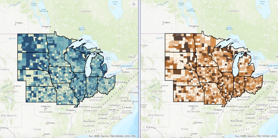
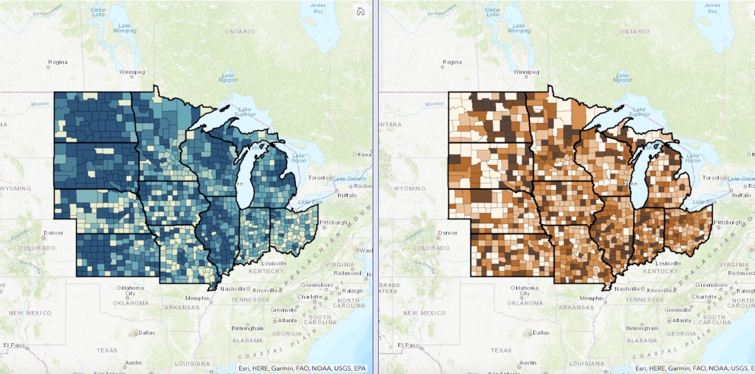
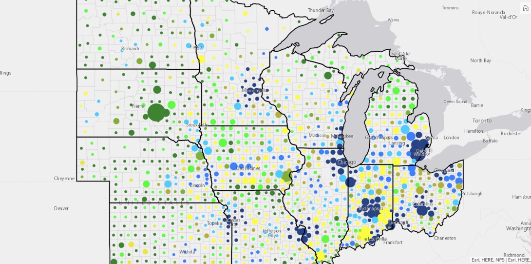
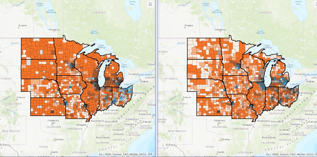
This COVID-19 dashboard is the first of this series aiming to assist professionals and the public in comprehending the COVID-19-related issues impacting their communities and generating action-oriented insights. The COVID-19 dashboard is an ArcGIS Online map series that contains multiple interactive data dashboards for displaying and exploring COVID-19 household and nursing facility deaths in the “North Central Region” of the United States from the beginning of the epidemic through November 29, 2020. The information will be updated based on the availability of data from the U.S. Centers for Medicare & Medicaid Services. Each tab at the top of this page displays a unique data viewing application at a county level. Some displays show cumulative death totals and rates, and some show the mortality data separated non-cumulatively by waves one and two.2 Filter panes on the left side of each tab facilitate filtering the data interactively. For tabs that contain maps, clicking on the counties in the maps will display more detailed information.
Map descriptions Heading link
- Cumulative death rate data: maps displaying household and nursing facility death rates side-by-side. Use the dropdown in the left pane to select a date and/or state. Data are cumulative. Try panning, zooming, and selecting counties of interest on the map.
- Wave separated death rate data: maps displaying household and nursing facility death rates side-by-side. Select wave (1 or 2) and a state in the left pane. Data are non-cumulative.
- Wave separated death rates vs. RUCC codes: maps displaying household and nursing facility death rates side-by-side. Select wave (1 or 2) and a state in the left pane. Data are non-cumulative.
- Wave separated death rates vs. population density: maps displaying household and nursing facility death rates vs. county population density. Select wave (1 or 2) and a state in the left pane. Data are non-cumulative.
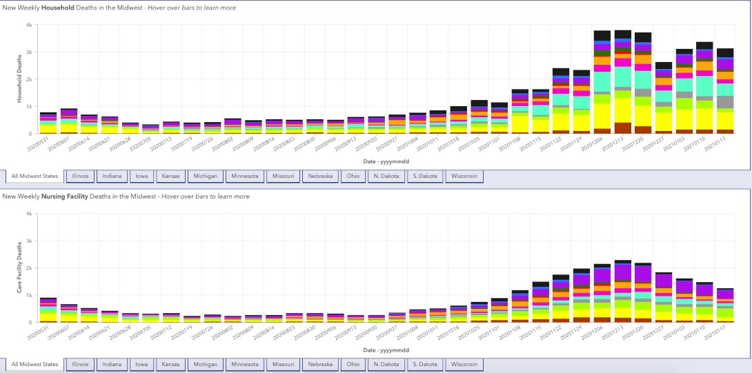
- Weekly total household and care facility deaths: charts displaying household and care facility weekly deaths by state. Focus on a specific state by selecting them underneath the charts.
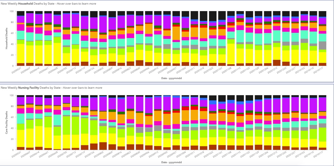
- Weekly proportional household and care facility deaths: charts displaying proportional household and care facility deaths by state. Select multiple states in the left pane to compare.
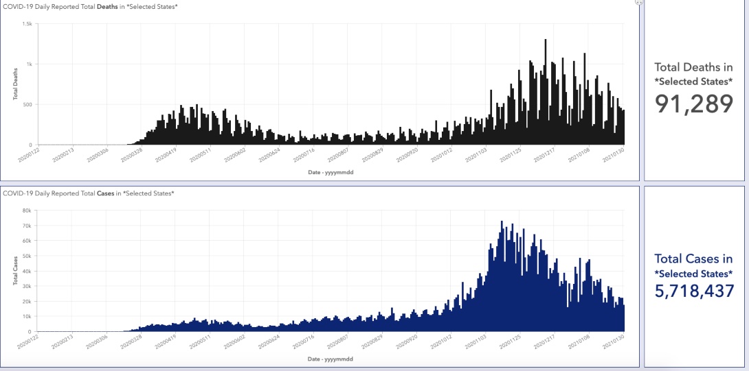
- Overall population daily reported deaths and cases: charts displaying daily reported total deaths and cases. Filter by state in the left pane.
Data sources for the dashboard Heading link
- OP-CSSE: The county-level overall population mortality and positive cases data are from the “COVID-19 Data Repository by the Center for Systems Science and Engineering (CSSE) at Johns Hopkins University.”3
- NF-CMS: The facility-level losses (archived dataset thru 01/17/21), as well as the occupied beds (i.e., used for rate calculation).
- The socioeconomic data used to obtain the rates per 100,000 are available from the U.S. Census Bureau American Community Survey; 2018 release of 5-year estimates.
Data preparation and preliminary analysis Heading link
Data preparation and preliminary analysis was performed with the IBM® SPSS® Modeler 18.2.1 and R dplyr V 0.7.8. Geospatial data integration, mapping, and initial spatial analysis were performed using ESRI’s ArcGIS Pro (ESRI).
The mortality data from the CSSE source involves the overall population. The PHGIS research team identified that with the use of overall population mortality, “commonly quoted public health outcome indicators are likely to be inaccurate and the spatial distribution of critical areas is likely to be distorted.”1 To avoid these issues, we separate mortality into two groups based on the residency status of the losses (nursing facility and household population groups). At a county level, this is accomplished by subtracting from the overall population mortality (OP-CSSE; aggregated at a county level) the deaths recorded in the nursing homes (NF-CMS aggregated at a county level). Due to the “week ending” reporting format available at the CMS data portal, the chronological scale is weekly and starts May 24, 2020. The mortality rate per 100,000 population is used to visualize and compare the spatial distribution of deaths at a county level. For the nursing homes rate, the number of occupied beds per facility is applied as a denominator.
Data limitations Heading link
To underline the limitations, public health agencies disseminating COVID-19 related data tag this data with disclaimers such as: “Information provided below is provisional, subject to change, and updated weekly. Facilities report data to their local health departments, which in turn report to IDPH, so lag time and discrepancies are to be expected.”4. The CMS COVID-19 nursing homes portal provides a more detailed outline of these data quality issues.
The data sets used for the visualizations are likely to contain problematic reporting spikes such as those depicted in the above figure. We highly recommend caution when using the (cumulative death rate data) visualizations by dates. The COVIV-19 dashboard provides the tools to explore the impact of these reporting issues by visualizing the data by dates or by waves.
The separation of household population and nursing facility deaths is based on the CMS data portal information. This database does not include deaths in assisted living facilities, personal care homes, memory centers, etc. Thus, with the above derivation, the household population numbers include losses occurring in assisted living and other congregate settings. The PHGIS Cook County COVID-19 study that relied on a different derivation approach1 estimated that the majority of losses, approximately 85 percent, are in the nursing homes reported by the CMS (results not shown). Thus, the residential household population death numbers are likely to be overestimated. At present, there is no other way to separate these losses at a county level for states. The inclusion of these two groups provides valuable insights. In addition, it substantiates the impact that the nursing facility deaths have on the spatial distribution of mortality (e.g., compare differences of nursing facility deaths between the two waves with COVID-19 dashboard).
First and second waves Heading link
Time is a defining parameter for this pandemic. At a Cook County level, the PHGIS team analyzed the characteristics of the two well-established mortality wave patterns and identified significant differences in the spatial distribution of COVID-19 related deaths between the two waves that cannot be ignored.2,5 For the second wave, the mortality progression pattern observed in Cook County is evident for all the Midwest states (see wave patterns in overall population daily reported deaths and cases map). Some states had well-defined first and second waves (Illinois and Michigan; see wave patterns in overall population daily reported deaths and cases map). Other states, such as Iowa, due to the relatively low first wave losses and the increased death toll during the second, lack a well-defined first wave pattern if the overall timeframe is used (start of the pandemic to present). For those states, the seven or 14-day moving average was used on a time scale that did not include the second wave losses (results are not shown). From these analyses, the following time periods were selected for each wave.
Timing of first and second waves Heading link
| State | End of first wave | Start of second wave |
|---|---|---|
| Illinois | August 2, 2020 | September 27, 2020 |
| Indiana | August 2, 2020 | September 27, 2020 |
| Iowa | August 2, 2020 | September 27, 2020 |
| Kansas | July 5, 2020 | July 19, 2020 |
| Michigan | August 2, 2020 | September 13, 2020 |
| Missouri | August 2, 2020 | August 3, 2020 |
| Nebraska | August 2, 2020 | August 3, 2020 |
| North Dakota | July 26, 2020 | August 3, 2020 |
| Ohio | July 26, 2020 | August 2, 2020 |
| South Dakota | July 26, 2020 | August 3, 2020 |
| Wisconsin | July 26, 2020 | August 30, 2020 |
Concluding remarks Heading link
The main purpose of this paper is to underline some basic quality characteristics of public service dashboards dealing with public health and environmental issues that the PHGIS team considers fundamental. Based on these characteristics, the dashboard was developed and its basic functionality was described.
The COVID-19 dashboard aims to assist professionals and the public in comprehending the COVID-19-related issues impacting their communities and generating action-oriented insights. No attempt was made in this paper to draw insights from the application of the COVID-19 dashboard. The authors hope that public health professionals will undertake this task and share with us their findings.
Point of contact: Michael D. Cailas, PhD (PHGIS-MCVD@uic.edu).
About the authors Heading link
Matthew Blaser is a geographic information systems research associate at the U.S. Environmental Protection Agency (EPA).
Michael D. Cailas, PhD, is an associate professor of environmental and occupational health sciences at the UIC School of Public Health. He directs SPH’s Public Health Geographic Information Systems online certificate program, and his research focuses on water quality monitoring network design, environmental data analysis, risk assessment and cost benefit analysis
John Canar, PhD in Environmental and Occupational Health Sciences ’97, is an environmental scientist at the U.S. EPA’s Superfund Division and an adjunct assistant professor of health policy and administration at the UIC School of Public Health.
Greg Arling, PhD, is a professor of nursing at Purdue University.
References Heading link
- Blaser M., Cailas M.D., Canar J., Cooper B., Geraci P., Osiecki K., Sambanis A. Analyzing COVID-19 Mortality Within the Chicagoland Area: Data Limitations and Solutions. Research Brief No. 117. Policy, Practice and Prevention Research Center, University of Illinois Chicago. Chicago, IL. July 2020.
- Arling, G., Blaser, M., Cailas, M., Canar, J., Cooper, B., Geraci, P., Osiecki, K., & Sambanis, A. (2020). A second wave of COVID-19 in Cook County: What lessons can be applied? Online Journal of Public Health Informatics, 12(2).
- Dong E, Du H, Gardner L. An interactive web-based dashboard to track COVID-19 in real time. Lancet Infect Dis. 2020 Sep; 20(9): e215. PMID: 32087114; PMCID: PMC7159018. DOI: 10.1016/S1473-3099(20)30120-1.
- Illinois Department of Public Health (IDPH). Coronavirus Disease 2019 (COVID-19). 5.Arling G., Blaser M., Cailas M.D., Canar J., Cooper B., Geraci P., Osiecki K., and Sambanis A. Cook County COVID-19
- Second wave early characteristics. UIC School of Public Health PHGIS program Story Map. Original publication date: November 9, 2020.