Proximity of Chicago Public Schools to TRI Facilities

Story text
In this analysis, a radius of 1.0 mile is used for each of the neighborhood schools in Chicago; in the original study, 0.5, 1.0, 1.5, and 2.0 miles radii are applied to compare results (not shown). To establish a meaningful proximity metric of the societal distribution of the burden, we will introduce the Toxic Release Inventory (TRI) School Proximity Burden score. For each school, i, the 1-mile TRI school proximity burden score is defined as:
(TRI School Burden)i = (PSS × TRIs)i
- PSS = the percent of neighborhood school students (from the total student population) in each school, i.
- TRIs = the number of TRI reporting facilities near school i within a 1-mile radius.
- This metric establishes the distribution of the proximity burden for each school, i, as a relative to the other schools score. For practical purposes, we will aggregate the TRI school burden at a Chicago community area scale, z, where nz = the number of schools in the community area z.
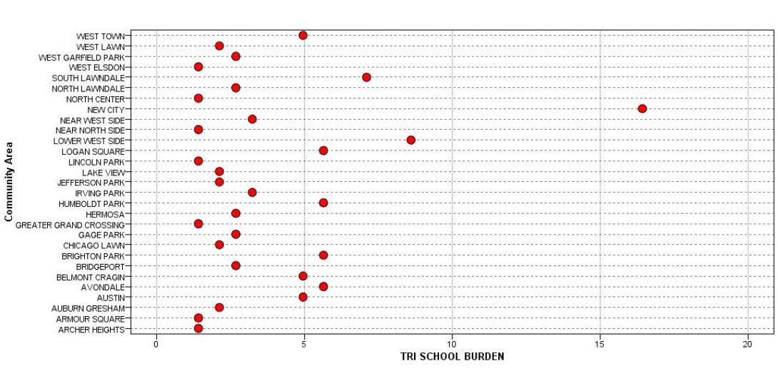
For example, New City, a community area in the South West section of Chicago encompassing the neighborhoods of Canaryville and Back of the Yards, has ten public schools in this category (i.e., nz = 10). Conceptually, the TRI School Burden|z score provides an estimate of the hazard distribution that each community area bears due to the proximity of its schools to TRI reporting facilities within a 1-mile radius.
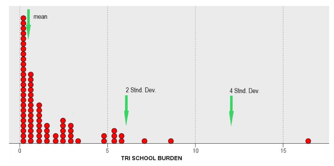
Under conditions of environmental equity, this burden score should be normally distributed. As we noted above, this is an unlikely situation. In reality, the distribution will be skewed, and the majority of burden scores will aggregate at the low end of the distribution with a few only scores forming the high-end tail. The sample mean of the scores provides an estimate of the “average” TRI school burden and establishes a threshold of comparison. The distances of each community’s burden score from this threshold will determine how severe the disparity is. To visualize the distribution of the TRI school proximity burden scores, we will use the following Dot Plot (Figure 1). This distribution indicates that three (3) community areas encompass schools with a burden significantly above the average in terms of their proximity to TRI sites within a 1-mile radius (i.e., 2 standard deviations above the mean burden).
The figures in the slideshow below establish that this proximity hazard distribution is significantly unequal. As seen, a few community areas bear a high burden (above the mean) due to the proximity of their neighborhood schools to TRI reporting facilities within a 1-mile radius.
Spatial hazard distribution disparities do not necessarily imply an elevated health risk due to exposure; however, they signify a structural inequity that cannot be ignored.