Poster Guide for Students
Elements of a Good Poster
Research posters serve as a medium for conveying key elements of your research in a comprehensive, creative, and engaging way to help publicize your research and spark discussion. Your poster can be circulated well beyond the conference date, and making it appear professional and compelling will help present your research in a more effective way. The below resources can help you create an organized, properly formatted, and attractive research poster.
Poster File Setup
PowerPoint
- When using PowerPoint, create your presentation on a single slide.
- Before designing the poster, the slide size must be set to your desired print size. You may need to choose custom dimensions for your file. Click here for instructions on changing the size of your slide.
- PowerPoint slides have a maximum size of 56 inches. Therefore, a desired 3×5 feet poster requires 18 inch x 30 inch slide size. A desired 4×6 feet poster requires 24 x 36 inch slide size. Posters can be printed at 200% to achieve the desired size. Confirm the file size limit and type for your conference/event.
- To prevent cropping when printing, set a 1-inch margin around the edges of the poster.
- To reduce file size, you can save your file as a pdf.
- SPH Poster PowerPoint Template
Mac vs. PC
- Posters created in PowerPoint for Mac are approximately equivalent to those created in PowerPoint for Windows. There can be issues when transferring the poster file from Mac to PC (i.e., fonts, colors, and sizing may change) and media file compatibility (i.e., images may not open) may not be exact. For this reason, we recommend you test your final poster slides with peers.
Poster Content
- There are many formats for scientific posters, however most posters include the following sections:
- Background – Contextual information/Problem definition/Rationale for study or evaluation
- Aims – Goals/Objectives/Choice of a particular solution for evaluation
- Methods – Design/Procedures for data collection/Procedures for implementation
- Results – Findings
- Conclusion – Implications/Interpretation/Impact of results and findings
- Your poster text should answer the following questions about your research:
- Why?
- What is this research contributing?
- Methods?
- What did the research find?
- What does the research recommend?
- Separate the major sections of your research into small blocks of supporting text to enhance readability.
- Keep your poster text concise to improve its readability and entice engagement.
- When including visual elements such as graphs or charts, create simple and effective data displays that are easy to see and understand.
- See last tab for examples and additional resources.
Font
- Printed or projected posters should be legible at 3-4 feet and the title should be legible at least 6 feet away from the poster.
- Virtual posters should be clearly legible when viewed on a standard size monitor at 100%.
- The poster title should be centered at the top of the poster and the title font size should typically be larger, for example a 3×5 printed poster’s title font should be between 60pt and 96pt.
- Use easily legible fonts such as Arial or Times New Roman.
- Use a consistent font, color, and size for all the headlines (though not necessarily sub headlines if your poster has any).
- Use a dark font color to ensure that your text will show up well against a white background (yellow on white makes the text very difficult to read). Bright or light colors will not stand out. Using a dark color (navy blue, burgundy, forest green, etc.) will be easier for the reader to see.
- The below font sizes are appropriate for a 3×5 printed poster, however it is important to check appropriate font sizes for different poster sizes, as well as digital posters:
- Title: 60-96 pt
- Headers: 34-40 pt
- Sub headers: 32-40 pt
- Body text: 20-24 pt
- References 10-12pt
Images
- Look at any pictures that are to be included at full size (e.g. if you’re making a poster at half size, use the Zoom feature to look at the pictures at 200%). The pictures may look fine on your screen at 33%, but could be pixilated when they are printed out full size on the poster.
- Do not copy and paste images into PowerPoint. Save the image separately and use the Insert function in PowerPoint to include it in your poster file.
- Charts and graphs can be copied and pasted into PowerPoint since these are not images.
- Photo images should be set at 125-200 dpi in JPEG format. Do not use .TIF in PowerPoint.
- Images that contain cartoons, illustrations, scanned text, drawings or charts should be 225 dpi in .GIF format.
- The SPH logo should be affixed at the top left-hand corner of your poster. UIC and other SPH departmental specific logos are available for download here (use formal lockup, informal lockup, or STK versions).
Spacing and Layout
- Use 1-inch margins around your poster when creating it in PowerPoint.
- Use columns to present your information.
- Use the ruler on the side of the PowerPoint slide (this can be added using the View tab and clicking on Ruler). If you have a lot of text boxes, pictures, or graphs, you might also want to use the Grid and Guides option. The top and bottom of each text box should be aligned so that the border of the poster is consistent throughout. Tip: Double-click on the text box to check and modify size.
- Try to keep the spacing between sections equal at least within a column and keep the spacing between the columns consistent. The spacing does not have to be large (¾” looks fine), and do not go too large – a space of more than 2” between the columns makes the poster look like there isn’t enough information on it.
- Justifying text (evenly distributing between the margins) can make the poster look more professional.
Tips for Creating Accessible Poster Presentations
- Use a font size that is easily legible.
- Always use a contrasting background.
- Use plain language.
- When presenting, always describe the images on your poster.
- Speak loudly, clearly, and directly at a moderate pace.
- Consider creating supplemental presentation handouts, such as copies of your poster.
- Refer to the American Public Health Association’s Accessible Poster Presentations website for more tips.
- Accessibility tips for virtual posters saved as a PDF:
- Words in ALL CAPS are not compatible with screen readers.
- Do not rely on colors or sensory characteristics to alone convey meaning.
- Use controls for audio.
- Use text instead of images of text.
- See the Adobe website for the Check Accessibility tool. This Adobe tool makes it easy to create accessible PDFs and check the accessibility of existing PDFs. You can create PDFs to meet common accessibility standards, such as Web Content Accessibility Guidelines (WCAG) 2.0 and PDF/UA (Universal Access, or ISO 14289).
- See the UIC Information Technology Resources page for more information on accessibility.
Additional Resources
- Ebook: Designing Science Presentations: A Visual Guide to Figures, Papers, Slides, Posters and More. Available to UIC students (requires NetID login).
- Harvard’s The Art and Science of Designing a Poster
- Health Services Research article “Preparing and Presenting Effective Research Posters.” This resource offers recommendations about effectively conveying scientific, statistical, and methodological information.
- Posterpresentations.com. This website contains many poster templates with various designs and color schemes. When creating your research poster, be sure to include the UIC SPH logo.
- Information about creating accessible posters: American Public Health Association’s Accessible Poster Presentations
- Scientific Poster Design. This PowerPoint by Cornell Engineering offers further suggestions about creating an optimal poster.
- Video: “Making a better research poster” by American Journal Experts
- Video: “How to create a better research poster in less time” by Mike Morrison
- Video: “Designing Research Posters” by UW-Madison DesignLab
- NYU guide to Poster Basics
- Writing a Poster Abstract
- Expanding Applicability of Presentations at Public Health Conferences (Available to UIC students; requires NetID login)
UIC SPH Poster Templates
Sample Poster Layout
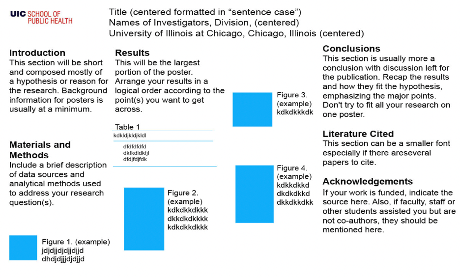
A sample poster layout for presentations, conferences, etc.