COVID-19 Data Analysis: Spatial Distribution of Mortality in Chicago
Residency status implications
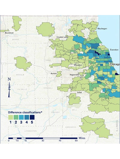
The significance of residency status is likely to have an impact on the spatial distribution of COVID-19-related mortality within the study area. From a geographic point of view, the LTCF and household population groups are distinct. Long term care facility (LTCF) mortality is reported as a point (with coordinates) variable, whereas the household population (HP)-related mortality is defined within a polygon surface (HP per ZIP code, per census tract, etc.). To study this effect, we analyzed, at a ZIP code level, the difference between the fatalities in the overall population and those occurring in the HP. The differences were classified into five categories in by Jenks’ natural breaks.15
Under the assumption that the residency status has no implications and that there is no latent factor present (i.e., LTCF), the classification differences would have been minor, falling within Class 1 or 2. The prevalence of the high difference classes, 3 and above (40 percent of the sample), indicate that the use of the overall population mortality can lead to distorted findings.
Impacts of high long term care facility mortality.
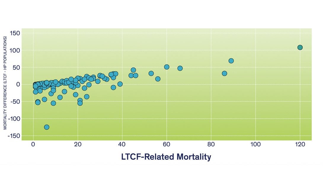
The importance of LTCF-related mortality is also verified by directly analyzing the LTCF and HP groups. Under the no implications assumption, the difference between LTCF and HP mortality per ZIP code would be randomly distributed in the Chicagoland area around the zero horizontal line. Figure 3 demonstrates that ZIP codes with a high LTCF mortality are likely to have a low level of HP-related mortality (i.e., difference is positive and high). As in Figure 2, LTCF-related mortality has a substantial influence on the spatial distribution of mortality at a ZIP code level of aggregation and cannot be ignored. Examining the environmental and socioeconomic reasons for this pattern goes beyond the objectives of this paper and it is the focus of a forthcoming publication.
Attempts to visualize a causal relationship by overlaying point and polygon layers is a common practice widely demonstrated in many recent publications. These maps are based on the mortality points (i.e., coordinates) overlaid on layers depicting the socioeconomic status of geographic areas. Conceptually this is a valid approach; however, it presupposes that each point is a single value. By disregarding the two distinct populations, the visualizations of mortality or infection are distorted since many of these points are, in reality, point mortality “clusters” representing LTCF with multiple observations. These mortality clusters are displayed on maps as single points signifying an individual loss. In reality, they represent something totally different, and in some cases are comprised of clusters with more than 40 deaths per LTCF (e.g., Niles Nursing and Rehab Center).3 By taking into account the LTCF-related mortality clusters, application of spatial autocorrelation tests such as Moran’s I is feasible since “the math for this statistic requires some variation in the variable being analyzed; it cannot solve if all input values are one.”16 The common approach to avoid this problem is aggregation (e.g., community areas level). Without accounting for LTCF-related mortality, this practice may yield questionable results due to the use of the overall mean, sample size for significance testing, and miss calculation of the distance weights matrix based on the centroid of each aggregation area (i.e., invalid random spatial distribution of deaths assumption).16,17