Proximity to environmental health hazards in Chicago
Previous reports in this series Heading link
Introduction Heading link
The proximity to hazards dashboard is the latest design from a series of interfaces dealing with environmental justice issues that started in 2019.1,2,3 One of the underlying objectives of these MCVD was to enhance the visual communication of the distribution of environmental burdens and benefits in the overall study area. Based on our interaction with the community all these years, we established that the distribution of environmental burdens needs to be expressed at least in an ordinal level of measurement, and the relative magnitude of the burden (or benefit) should be associated with a recognizable place or location. For the first two dashboards, the recognizable geographic unit of a Chicago community area (CA) was selected,1,2 despite the limitations that have been identified.4 For the current proximity to hazards visualization interface, a different design approach was adopted to satisfy community end-users needs. These needs, which became design constraints as well, are summarized in the following two questions:
- what are the hazardous sources in a 1/4, 1/2, etc. mile radius around a specific location (such as home, school, permit for a new industrial site, etc.)?
- within the selected perimeter (1/4 mile), what are the locations with sensitive populations (such as schools)?
With this “nearby” design approach, the concept of proximity burden ceases to be an abstract construct concerning a potential exposure of a population within preselected boundaries (such as community area, block group, etc.).1 This proximity to the hazards dashboard places individual community members at the center of a cognitive frame. It provides an answer to a common question raised during our meetings: “which polluters are near my home?” (or the school of my children).
During the six-month interaction period, several design changes were implemented, and community members guided us in including additional information deemed necessary for a decision and advocacy support tool. This is the original version of this proximity to hazards dashboard, and within the next six months, we foresee additional improvements based on the input we are receiving.
View the interactive map
About the data Heading link
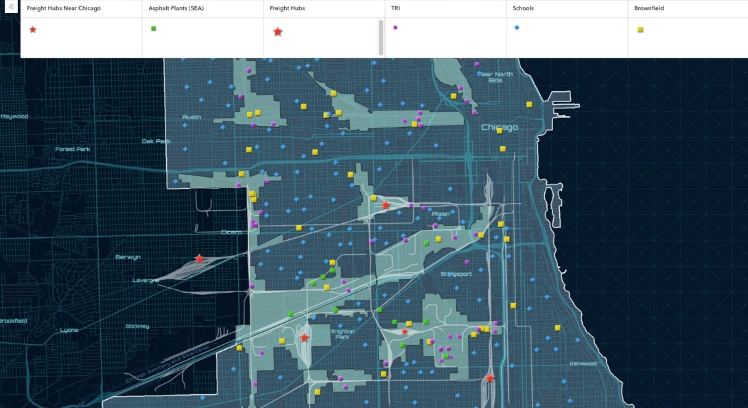
Depending on screen resolution, version 1 of the this dashboard interface provides basic geographic information such as the names of community areas (such as Brighton Park), landmarks, streets, and highways for a quick orientation. The industrial corridors of the city are clearly demarcated since within those boundaries the majority of the industrial activity takes place.
After setting the proximity radius (from 0.5 to 2 Km; 1.6 Km is 1 mile), end-users can click within the map on a location of interest or search for an address to learn more about the location and its surrounding area. The results will include information about the nearby hazardous sources of interest. For this version of the the dashboard, we included as locations of interest Chicago public schools and for hazardous point sources the following:
- Toxic Release Inventory (TRI) reporting facilities is a well documented source of hazardous emissions. The US Environmental Protection Agency (EPA) TRI information and data portal is a resource for the public to learn about toxic chemical releases reported by industrial facilities and was created by the Section 313 of the Emergency Planning and Community Right-to-Know Act (EPCRA, 1986). The location of the TRI sites and background information about the toxic emissions (i.e., quantity, carcinogenicity, etc.) is from the US EPA TRI Basic Plus Database.
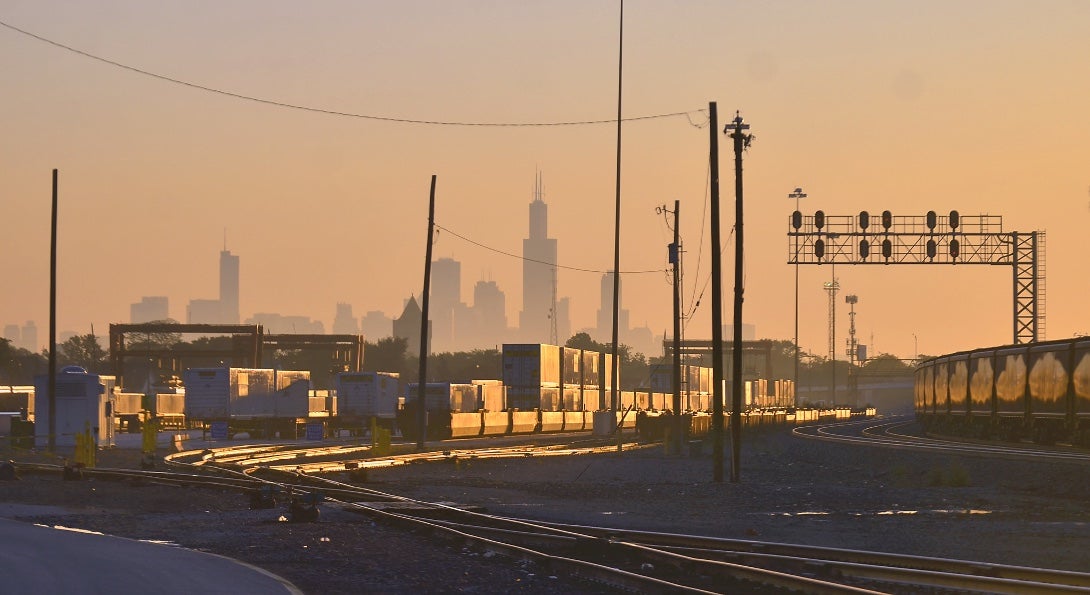
- Rail yards: The City of Chicago has eight major freight railroad hubs. Six of these eight hubs are located in the southwest section of the city. Railroad hubs are known to be a major source of particulate matter pollution. The data source for these hubs is the US Department of Transportation on-line data portal.
- Brownfields: “A brownfield is a property, the expansion, redevelopment, or reuse of which may be complicated by the presence or potential presence of a hazardous substance, pollutant, or contaminant.” These large pieces of land are a major impediment for growth since the potential presence of contaminants complicates their reuse or redevelopment. In order to measure both the proximity and density of brownfields in Chicago the US EPA’s “Cleanups In My Community” (CIMC) data set was used.
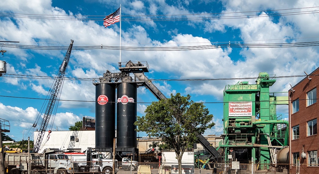
- Asphalt plants. A major concern for the Southwest communities is the numerous asphalt producing and processing facilities located in this section of the city within the residential zones. These facilities are not part of the TRI section 313 reporting program since in 2002 they were de-listed (i.e., “no asphalt concrete manufacturing facility has the potential to emit HAP approaching major source levels.” They are, however, regulated by state and federal agencies and require a permit to operate. Asphalt plants in the southwest section of the city are listed by name and address only; this information was provided by the Southwest Environmental Alliance. Work is underway to include all the asphalt processing facilities within the city limits.
An original aspect of our dashboard is that emphasis is placed on a sensitive and relatively immobile population living in these communities: kindergarten (age 5 to 6) to 8th-grade school children (K-8). In recognition of their vulnerability, the 1997 Executive Order (EO) 13045 (62 FR 19885; April 23, 1997), states that: “each Federal agency:
- Shall make it a high priority to identify and assess environmental health risks and safety risks that may disproportionately affect children;
- Shall ensure that its policies, programs, activities, and standards address disproportionate risks to children that result from environmental health risks or safety risks.”
Guided by this executive order, the Office of Children’s Health Protection (OCHP) was created aiming to “ensure that all EPA actions and programs address the unique vulnerabilities of children.” Students in neighborhood public schools were only included in the PHD since most of these children are likely to reside in the local communities where the schools are. Based on the CPS district data portal information, the K-8 student population for the 2016-2017 school year was 181,357, concentrated in 328 schools. Almost half of the student body is Latinx, and 79.1 percent live in below-poverty households.
Data potential Heading link
We selected ESRI-ArcGIS’s “Nearby” configurable app template to create the maps and the information reports because of its optimized interface for both desktop and mobile browsers. In addition, communities in other cities can create similar interfaces without resorting to complicated programming. The underlying functionality of this application is the ability to search for places of interest (i.e., hazardous sources) and record their features within a cyclical perimeter around a focus location. For example, within a 1-mile zone (1.6 Km) of one school, the maps show one freight hub, four asphalt plants, 7 TRI (emitting 29 toxic chemicals), three brownfields, and seven other schools.
For this version of the proximity to hazards dashboard, detailed information about the emitted chemicals from the TRI facilities is provided. For example, at a 0.96 Km (0.59 miles) distance from the selected school, a TRI facility releases nickel and nickel compounds (CAS#: 7440-02-0; 1,682 lb per year; 2017 TRI data). In an occupational setting, it is known that long-term exposure to this pollutant can cause allergic reactions in the skin and respiratory tract and asthma, and cancer of the lung and nose.5 In the vicinity, another school southeast from the focus location is at a 0.53 km (0.32 miles or 569 yards) distance from this TRI facility.
As we mentioned above, this interface allows end-users to enter an address and identify the surrounding places of interest. A practical application of this interface is its assistance for identifying the spatial accumulation of hazardous sources within an area undergoing a permit approval process. The number of schools and their proximity to these sources should be a primary concern for such a decision support tool, and it is included as an underlying feature of this interface. Currently, information from this interface is used by community groups for the sitting of a scrap metal recycling facility. As seen within a 1-mile radius, this facility is adjacent to eight Chicago public schools with 3,359 children (kindergarten to 8th grade). One school is only 0.29 miles from this facility (see red line). In addition, within the 1-mile cyclical buffer, there is one brownfield, six TRI facilities, and one asphalt plant.
The ultimate goal of this dashboard is to instrumentalize (in the final analysis) the relevant data, visualizations, and information for communities and policymakers aiming to pursue environmental justice issues and resolve them. For this reason, it is paramount to assure the quality of the data and the application of a rigorous data integration approach. On the other end, visualization will not satisfy our goal of instrumentalization. Visualizing on a mobile device “next door” proximity of a school to a TRI facility can signify for end-users many things (such as jobs for the community), and eventually become a fact of life in this part of the city. Comprehensive information is required to reveal the accurate dimensions and potential consequences of proximity to hazardous sites and to underlie the differences in the distribution of hazards. For this version of the dashboard, all the proximal sites of interest are demarcated within the selected cyclical buffer zone, and their distance from the center is indicated.
For this version of the the dashboard, detailed results of the TRI reporting facilities are presented. As stated above, schools are a prominent place of interest for our research; for this reason, the results will provide details for each school within the cyclical buffer (such as attendance statistics (school type, number of students, percent low income), demographics, etc.).
About this project Heading link
The UIC School of Public Health’s Emergency Management and Resiliency Planning (EMRP) program, in collaboration with the Electronic Visualization Laboratory and content experts, is presenting a series of Midwest Comprehensive Visualization Dashboards focusing on environmental health and justice issues in this region. These dashboards have two components: visualization interfaces (links to interactive maps) and the end user documentation (such as background information, data sources, methodology, findings, etc.).
The first two dashboards identified that several categories of hazardous sources in Chicago are likely to be concentrated near neighborhood public schools in communities with a predominantly Latinx student population.1,2 In this current data set, a different approach was implemented based on the input we received from a six-month interaction with community groups and policymakers. This approach relies on a community-based participatory design approach to develop representations of data that community members can understand and findings to substantiate their environmental justice claims. Policymakers benefit from these interfaces since they make visible environmental justice issues (such as railyards in the southwest section of Chicago) requiring an equitable resolution.
The UIC community-based participatory design approach Heading link
As part of the adopted community-based participatory design approach, dashboards were created based on the selected categories of hazard sources deemed to pose a threat to the communities of Chicago.1,2 To improve further the interfaces, a community engagement and input period was implemented from July 10 to December 10, 2021. During this period presentations and focus group meetings were conducted organized by the Southwest Environmental Alliance and policy decision-making entities of Chicago (July 28: 25th Ward CBO stakeholders meeting; September 14: Latino Caucus of Chicago; October 19: Committee on Environmental Protection & Energy, City of Chicago City Council). The purpose of this interaction period was to engage the local stakeholders in discussions about the sources, the dashboards and the information they convey. The focus was to create a useful interface with supporting documentation and visualization maps. The dynamic nature of this approach created revisions of the previous dashbaords1,2,3, as well as the current interface which aims to address specific needs of community groups dealing with environmental justice issues (such as permits for new facilities). The underlying theoretical background of this approach and the technical details of the resulting proximity to hazards visualization interface will be presented in a forthcoming publication; in this report, we focus on the end-user needs and a few of the potential applications of this interface.
The community-based participatory design approach is feasible thanks to the UIC library portal Indigo, which “collects, disseminates, and provides persistent and reliable access to the research and scholarship of faculty, staff, and students at the University of Illinois Chicago.” This portal established an easy to access communication link between the dashboard and the end-users. The various versions of the supporting documentation archive the evolution of this effort and the changes instigated by the community-based approach, which by nature is dynamic.
Learn about public health and environmental justice Heading link
References Heading link
- Flax-Hatch, J., et al., (2021) MCVD: Environmental justice and neighborhood schools in Chicago, Illinois: Part I.
- Flax-Hatch, J., et al., (2021) MCVD: Environmental justice and neighborhood schools in Chicago, Illinois: Part II.
- J. Flax-Hatch, et al., Identifying Environmental Hazards within Southwest Chicago. UIC-SPH and SEA story map. Original publication date: 20 March 2020. Based on the results presented at the Community Meeting at National Latino Education Institute 01/16/2020.
- Flax-Hatch, J., et al., (2021). Visualizing environmental justice issues in urban areas with a community input approach. Spatial Data Science Symposium 2021 Short Paper Proceedings. UC Santa Barbara: Center for Spatial Studies.
- Agency for Toxic Substances and Disease Registry (2005). Toxicological profile for nickel. U.S. Department of health and Human Services. Division of Toxicology/Toxicology Information Branch.